By Todd Merry
You’ve invested countless hours (and $$$) in planning, designing, building, testing, and implementing your new website. It is beautiful! But, are people going to use it? Are they going to find the information they’re looking for? How will you know that your investments have paid off? What will you tell your stakeholders if they ask how the new website is performing?
You need to be able to report on the website performance on a regular basis. You’ve already had the IT department implement analytics on the website to start capturing data that describes user behaviors, but what to do with all that data? How best to present it, and in what format?
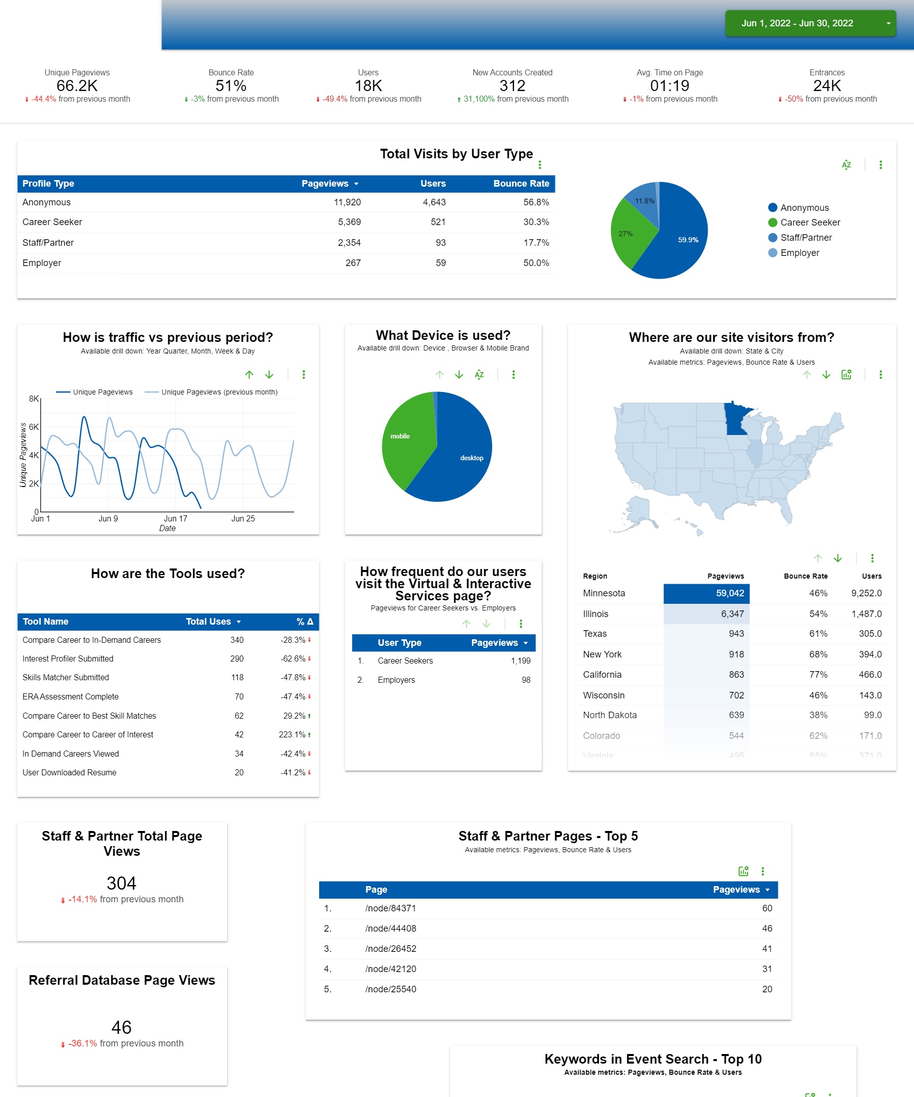
The answer is most likely an Executive Dashboard that summarizes your website’s performance. Data dashboards provide visual data from your website using charts and tables that detail user activity, from number of visitors, to bounce rate, and average time on page. The hallmarks of successful Executive Dashboards include:
- Dynamic and reliable as a source for high level metrics
- Accessible to all stakeholders without needing access to the analytic platform
- Easy to use and understand (K.I.S.S. principle)
They should also:
- Allow users of the dashboard to drill down into the data
- Offer insights into trends that highlight possible issues
Data dashboards are especially useful in the public sector for providing data to the people who need it…similar to the COVID Data Tracker that the CDC maintains.
Creating a dashboard
Sound like just the thing? There are several software providers that provide web-based analytic tools that you can utilize to build your dashboard. All of the examples and screenshots provided in this article were built in Google’s Data Studio, our analytics reporting tool-of-choice. The tool is free to use, and there are some superb web-based training guides from Google’s Analytics Academy (also free!) that can help get you started.
The following guidelines provide a step-by-step process for assembling an information-rich executive dashboard from your website’s data to share with stakeholders.
Step 1: Collect requirements
One of the first steps in any project, large or small, is to understand stakeholder needs. If you do not fully understand the purpose that your executive dashboard will serve, how do you know what information to include? We start by interviewing and/or surveying the stakeholders to identify those needs. Here’s how:
a. Plan
Identify the primary users for the Executive Dashboard, some common places to look include:
- Key stakeholders:
- Website admins
- C-Level staff (CIO, CFO, CEO, etc…)
- Content Creators
- Department managers – Not necessarily all IT department personnel either. For example, does your website have a career section? If so, it’s likely that Human Resources will have an interest in how website users are finding and utilizing information in that area of the site.
b. Interview
Set up stakeholder interviews keeping S.M.A.R.T goals in mind:
- Specific – What are stakeholders most interested in seeing for metrics?
- Measurable – Explain to stakeholders what you know you are able to measure and report on with analytic data. Remember, collecting and reporting on Personally Identifiable Information (PII) data is a no-no! Laws regarding PII vary from country to country, so to be safe, you should follow best practices to avoid collecting PII.
- Achievable – If stakeholder interests are not available in reports, can they be captured with minimal effort in customizing how data is collected in analytics?
- Relevant – Does the data requested by stakeholders assist them in making business decisions to improve how website users interact with the site? Examples include:
- A chart that shows the most popular browsers/devices used to access your site, that could help you understand if you need to optimize the responsiveness of your site, to help increase mobile traffic.
- Where is your website traffic coming from, that could help you decide where to spend your ad dollars to increase traffic.
- A short list of the most visited pages, which might help you decide what pages to prioritize for marketing on the homepage, to increase traffic to those less-visited (and important!) pages.
- Time bound – Is the data relevant over a specific period (i.e. is it campaign-based or is the user interested in seeing trends (current period vs. previous period)
Next, you interview and record details from each stakeholder, guiding them to identify requirements that fit the S.M.A.R.T. guidelines above.
c. Organize
Once you’ve interviewed/surveyed all of your stakeholders, it’s time to organize what you’ve collected into actionable reports for your dashboard. I’d recommend grouping the requirements that you’ve gathered into three distinct categories:
- Common needs – Identify common requirements, placing them at the top of the priority list for placement in the dashboard. Common needs will usually boil down to easily understood metrics like:
- Total unique pageviews
- Total unique visitors
- Average time on page
- Departmental or campaign-based needs – These requirements should be grouped together on the dashboard, with some logical positioning that is below the common needs area, but is still easy to find.
- Other needs – Consider discarding, or placing low on the priority list for inclusion, any requirements that:
- Only one or two stakeholders requested
- Data that is not yet available in analytics (additional development is needed to make the data available)
- Metrics that are difficult to reliably produce with the analytic data that you have
Furthermore, if data is available that is a subset of data being reported in one of the higher priority needs, consider providing the ability for users to drill down into the data presented on the dashboard, or use a callout/URL link to another separate analytics report.
Step 2: Build the dashboard
a. Place common/high priority reporting needs above the fold
After collecting your stakeholder requirements, many common interests will become evident. These common data points should be provided at the top of the Executive Dashboard and referenced as KPIs, or Key Performance Indicators.
b. Place departmental or campaign-based metrics below the fold and grouped together if possible
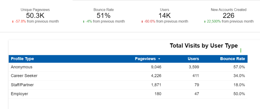
Less common stakeholder requirements that have been grouped into departmental or campaign-based needs can either be placed below the more common KPIs, or added to secondary pages of the Executive Dashboard.
Keep in mind: Sometimes departmental or campaign-based requirements have sensitive data that may not be for all eyes who have access to the dashboard. If you have certain elements of the dashboard that contain sensitive data, make sure that you apply the necessary access controls to the portion of the dashboard that contains sensitive information. In Data Studio, we often create a separate page in the dashboard for a limited audience that require the ability to see more sensitive information.
c. Make the dashboard useful
A good dashboard is more than an assembly of charts, tables, and graphs. Each element of the dashboard should be easy to understand for all visitors.
Tips for making it easy to use:
- If there are controls that allow the user to see different sets of data, make sure a concise explanation of the controls is provided.
- Use text callouts to describe what each metric is reporting on, and note if the user is able to drill down into data for that metric.
- Make sure the axis’ on each metric are adequately labeled, and where appropriate, provide a legend that gives the user context on what the metric is conveying.
Tips for highlighting insights:
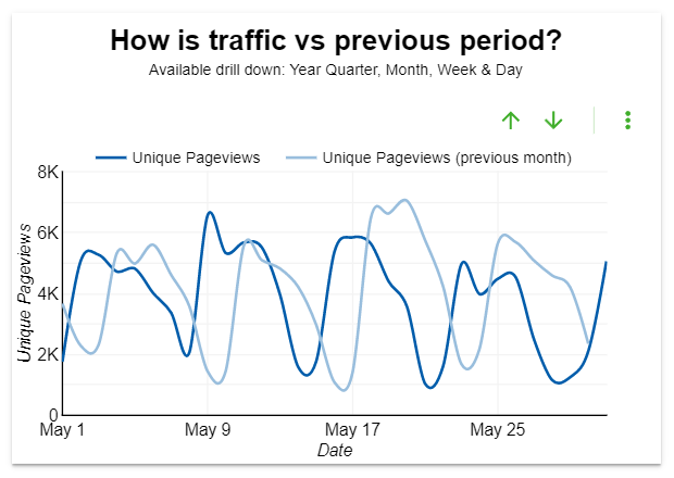
- Where appropriate/helpful, include trends for the previous period selected.
- Allow dashboard users to change the period of the data being reported, but also configure a default date (Last Month, Last Quarter, Last year, etc) that makes the dashboard report useful upon every initial visit.
- Provide users the ability to either print or export (PDF) the dashboard report. The ability to share the report via email or on the company intranet may also be desirable.
Step 3: Publish, review, iterate
If you are using Google’s Data Studio, the easiest way to publish your dashboard is to simply share the URL that provides Read Only access to the report. Data Studio also has a publishing mechanism that enables you to update/enhance your dashboard in draft mode, giving you the flexibility of publishing enhancements when they are ready.
After publishing the dashboard, take steps to get input from some/all of the users who provided the original requirements:
- Demonstrate the dashboard to key stakeholders, showing them how it is used, what data can be found where.
- Get input and feedback on how the analytic data is being presented in the dashboard.
- Iterate on the dashboard, based on input provided.
After incorporating any feedback that was collected from the stakeholders, republish the dashboard and provide access information to all of the stakeholders that should have access to the dashboard.
Ta-dah…the dashboard is good to go!
The key to a good dashboard is good data, so once the dashboard is up and running, the requirements should be revisited and refreshed on an ongoing basis. Your content is more than likely dynamic and updated on a frequent basis, so your dashboard (which represents how users are utilizing the website) should also be kept fresh.
As we know from the CDC’s Covid tracker, when data changes day to day, data dashboards are the easiest way to keep people informed.
Learn more
- Contact us to learn more about creating a data dashboard for your website
- In Utah, coronavirus decisions are fueled by real-time data, via StateScoop
- Simplifying the Complex With Function Point Analysis – Part 1, by Todd Merry