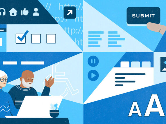
As we help make government websites and products more user-centric, user experience design has become an increasingly important focus at our company.
We spoke with UX specialists Amy Mauriello and Karin Carlson about their usability work on a state benefits enrollment process.
What’s interesting about your current project?
Amy: We’re putting together a streamlined form for a state healthcare application. It’s not a digital project, but a physical paper form so it’s different from many of the projects we do. Working with paper is a unique kind of challenge, but we use the same usability techniques as with digital.
Karin: It also still needs to use plain language without jargon, and be accessible to all user types.
Why is this form needed?
Amy: The federal government has mandated that all of their Medicaid and healthcare assistance programs, along with the state healthcare programs that fall under the Affordable Care Act, need to be easier to apply to.
A modernization effort has been instituted to make sure these kinds of projects go to small agile agencies such as ourselves. Organizations like 18F are encouraging government to look outside of their normal vendor list at smaller vendors using cutting edge technologies with a proven track record of large-scale projects similar to their needs. The client was happy with our portfolio of public sector work and selected us for the project.
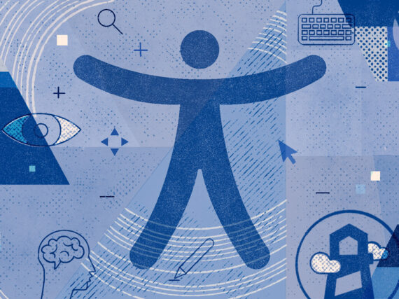
We are very fortunate as UX professionals to be working on government projects such as this. There’s a lot of opportunity in this field, especially because our work has to be accessible to people with disabilities. It’s exciting.
What’s the goal of the project?
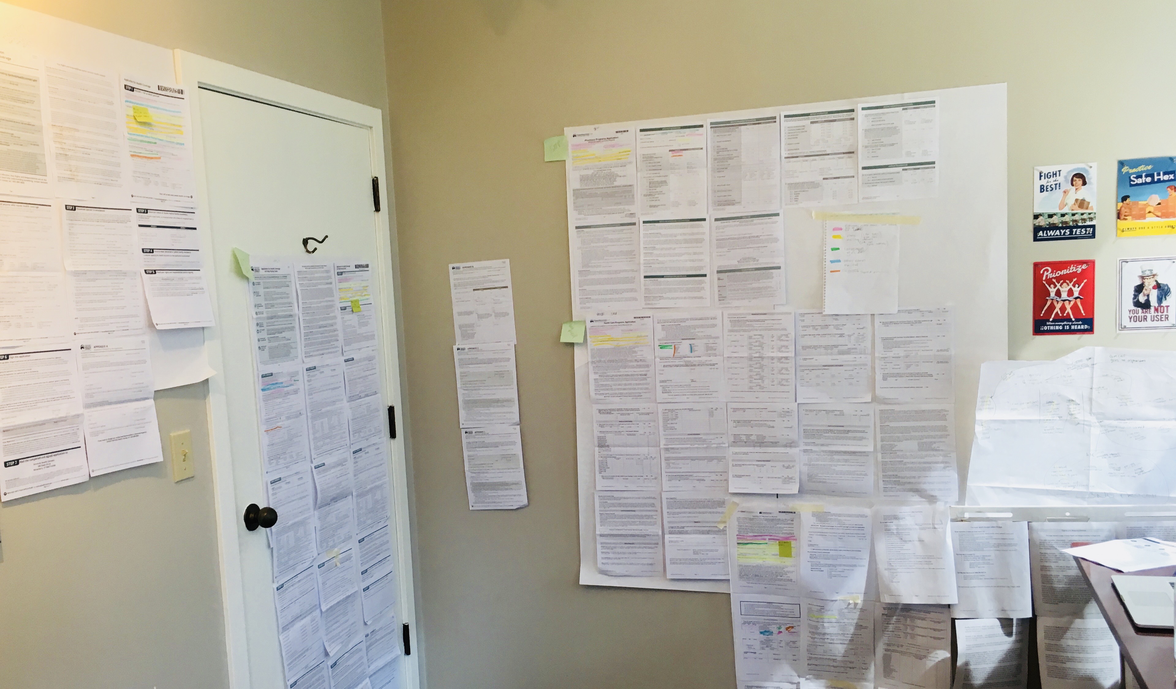
Amy: We need to merge five forms into one form. We’ve been cataloging all of the different questions from all of the forms. This is why the wall in our office looks pretty intense, we’ve hung up every single page on my wall.
Karin: There are currently separate forms for prescription assistance, qualified healthcare, Medicaid, long-term care, etc. I’ve been transcribing each of the five forms and figuring out what questions are duplicated.
As the newest employee, there’s a mentorship situation going on here. I’ve had a lot of jobs, but never this level of mentorship and guidance. I feel very lucky to be at this company.
Amy: We’re happy to have you. You have a great analytical mindset, it’s important in UX to be able to get excited about complex problems and solving puzzles. Most of all, we have to be empathetic to users. Step into their shoes and remove bias. Just because we might want it to turn out a certain way, doesn’t mean it will turn out that way.
What is your approach?
Amy: To start with, we did a number of stakeholder interviews with people representing anyone who comes in contact with those forms.
Then we did contextual interviews, or field studies, to observe people using the forms in the processing center, and see how they go through them step-by-step.
What did you find out?
Amy: This project has a more diverse set of users than most projects. We put together about six-to-eight personas, which is very rare to have so many, and is pretty complex. This was not just one type of person using a platform to fill out info and submit it, and another who’s administering it. Many people have to physically touch the form to get it into the database so that a number of different kinds of people can get benefits.
There’s a processing center where they have certain steps they have to go through. First, a clerk picks up the mail, counts the letters, opens them, tears them apart at a desk, takes the staples out, and loads them in the scanner. Then they put them in a cubby with a batch number.
Next, an indexer comes by, picks up the forms, and brings them to a desk. They go into the system, type in the number, find the batch, and then tag it for the right department depending upon if it’s long-term care, qualified health plan, or Medicaid, etc.
So we created what we called a “form journey map,” where we showed all the places that a form goes. It’s pretty amazing to see the big picture.
Karin: You did a great job with that. It’s a flow chart for the forms.
Amy: Thank you, it’s been fun. It helped the people who are looking at our findings to really understand the complexity.
How do you use the info you gathered?
Amy: Once we completed the interviews and studies, mapped the forms, and put together the personas, we focused on the user stories. They reinforce a user-centered design approach so the tasks to develop the product will accommodate the users.
The key to a good user story is the same as a good requirement. You make sure it’s simple and uncomplicated, with no guess work. A good example would be, “As a user, I need to clearly understand what program I’m signing up for.” Then you break that down into smaller stories, or tasks for the team.
Karin: We prioritized the basic goal of the product, which in this case was to merge the five forms into one.
Amy: Yes, we determined the minimum viable product needed to meet the guidelines for the project.
Karin: Then we can add the nice-to-haves.
Amy: That’s the icing on the cake. This is easier to do when it’s digital because you can always add it later. For this project, it’s paper, so when it ships, it ships.
Amy: Many states have approached this process a little differently, so we looked at a number of them for comparative analysis. Michigan was one of the best we found. They did an amazing job of putting together one clear concise form.
For another example of simplification, look at TurboTax. People return year after year because it’s easy and doesn’t use jargon so you don’t feel stupid. Intuit has a huge UX team behind their product that makes sure it’s easy to use.
Karin: It’s about something complex, made simple. You want to make these things as simple as it would be to understand a simplified version of string theory.
For example, in Clear+Vivid with Alan Alda, a scientist described string theory as simply as possible to Tina Fey. She reiterated her understanding of his explanation of string theory as, “you’re attempting to unify the theory of relativity and quantum physics so you have one language to describe all of it.”
What does success look like?
Karin: A form that gets benefits to people without a lot of frustration.
Amy: Yes, success would be knowing that these people aren’t frustrated and don’t have to spend so much time on it. Also, fewer error rates, fewer calls for help, and quicker application approval.
Anything we do with UX, we need benchmarks to determine success. Did we improve, did we make a difference?
What’s great about working with government is that it has an altruistic aspect. I’m not trying to sell something that people probably don’t really need. I’m making a difference for people. It’s not just about a cool design, it’s something that can help improve people’s lives.
Author bios
Meet Amy and Karin on the team page of Portland Webworks, GovWebworks’ parent company.
Join our team
We are always seeking UX specialists to build innovative solutions for our growing client base. We have a great benefits package and annual profit share averaging 16 percent of base salary. Located in Portland, Maine’s charming Old Port, employees enjoy in-house yoga, Friday happy hour, and other great perks.
See our Careers Page for current openings.
To learn more about us, we hope you will check out the Portland Webworks team, and our Facebook and LinkedIn pages. You also might like our MailChimp-style report on company stats and figures, the 2017-by-the-Numbers report.
Feel free to contact us with any questions!
Learn more
Related posts
- Roadmap for Transportation Success: How state DOTs are improving online user experience
- Does Employee Happiness Matter?: How the public sector can learn from the private to increase workplace satisfaction
- Hat-trick for Best Place to Work Award: Portland Webworks to receive third award for best small business workplace