As a K-12 classroom educator, I remember the anxiety that came over me the first time I observed 24 third graders trying to find equivalent fractions using an online classroom whiteboard. When students struggled to navigate these new tools, I found I couldn’t circulate around the room as usual and give private feedback, or gather a small group of students for further instruction while others worked independently in the background. My ability to focus on classroom instruction was seriously disrupted.
Each day my colleagues and I left feeling defeated yet motivated to figure out how to improve the online learning experience for our students. The opportunity to reimagine online learning was a primary reason for me to make a career change to join the team at GovWebworks to help the Maine Department of Education (DoE) improve a newly created online learning platform, Learn with MOOSE.
The skills and knowledge gained from seven years of K-12 instruction and classroom management were directly transferable to my new job as a user experience designer. I wanted to share the following insights with my colleagues and others on how we approached and solved the DoE’s needs for online educational tools.
What is MOOSE?
So what is MOOSE? It’s an acronym for Maine Online Open-Source Education, created by the Maine DoE in collaboration with curriculum coordinators, educational community organizations, museums, learning centers, and educators. The platform helps to address the inequitable access to in-person education that became more apparent at the beginning of the Covid-19 pandemic.
As a UX designer on the project, I worked with my team to reach the following goals. We wanted the tool to be:
- Easy: To help students navigate the tool and reach their goals to learn new skills and gain new knowledge.
- Engaging: To inspire a love for exploration and learning.
- Manageable: To make online learning attainable and not overwhelm students with too much information.
The cool thing was that these education goals are similar to the usability goals we apply to all projects. These UX ideas and practices improve online learning experiences in the same way that educators leverage instructional best practices to improve student learning.
Design thinking to the rescue
The challenges brought on by the pandemic created an urgent need to transform a variety of practices within the K-12 education space. Educators across the world quickly learned to leverage new ways to build relationships with students and families and meet the needs of diverse learners in an online classroom environment. Through trial and error, educators were tasked with finding new strategies for facilitating interactive learning experiences. These solutions include incorporating digital tools that increase student understanding and support the practice of newly acquired skills in an online classroom. What seemed to be a challenging and unresolvable task for educators from the onset has stimulated the creativity and innovative thinking that already existed among educators across the globe.
At the beginning of every school year, educators like myself prioritize an understanding of the complexities of their students’ experiences. Year in and year out, we:
- Gather data on students’ past and existing academic and behavioral experiences
- Design and implement strategies for instilling a joy of learning and increasing academic and behavioral growth
- Assess the success and shortcomings of our strategies, and revise those strategies in response to findings from assessments to improve the student experience and achieve successful outcomes
The process we used above is very similar to the design thinking process by UX practitioners. Design thinking is commonly, yet often unknowingly, executed by educators in classrooms everywhere. Not only is this process leveraged in K-12 classrooms, but so are many best practices in usability. Meeting the needs of diverse users goes hand-in-hand with meeting the needs of our diverse learners.
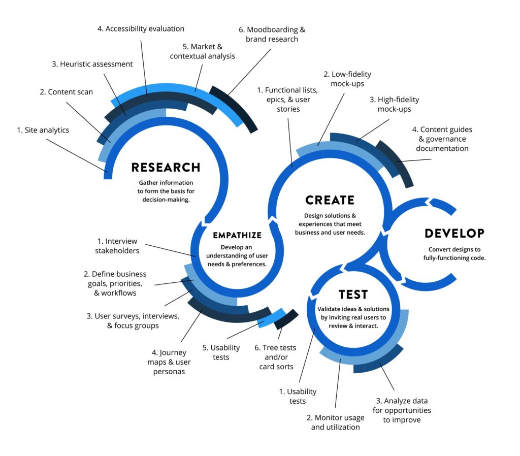
An illustration of the steps in the design thinking process used by GovWebworks.
How we apply UX for online learning
The redesign of the Learn with MOOSE platform illustrated the intersections between K-12 educational process and UX design goals in three notable ways. The following priorities are the result of bringing design thinking and the educational process together to create online tools that inspire and engage students.
Our goals for the MOOSE online learning tools were to make them:
- Easy and intuitive
- Engaging and memorable
- Follow a manageable step-by-step process
1. Easy and intuitive
First, designing a user-friendly and accessible digital experience is similar to how educators design an intuitive way for students to navigate classroom resources quickly and efficiently. Every year educators have to create easy and efficient practices for maximizing student learning time, which became even more important as in-person classrooms transitioned to the virtual space. We sought ways to minimize student disruption by creating:
- Easy systems for distributing and turning in classwork
- Management tools for student instructional materials for 20+ students
Creating quick and simple routines and procedures for achieving these tasks has proved to maximize student learning time. Similarly, the Learn with MOOSE platform benefited from a redesign of the presentation and access of information, so that certain features were easier to recognize and use. For example, we implemented interactive states that offered more depth of information, and recognizable styling patterns for components to support users in easily discovering or finding modules of interest.
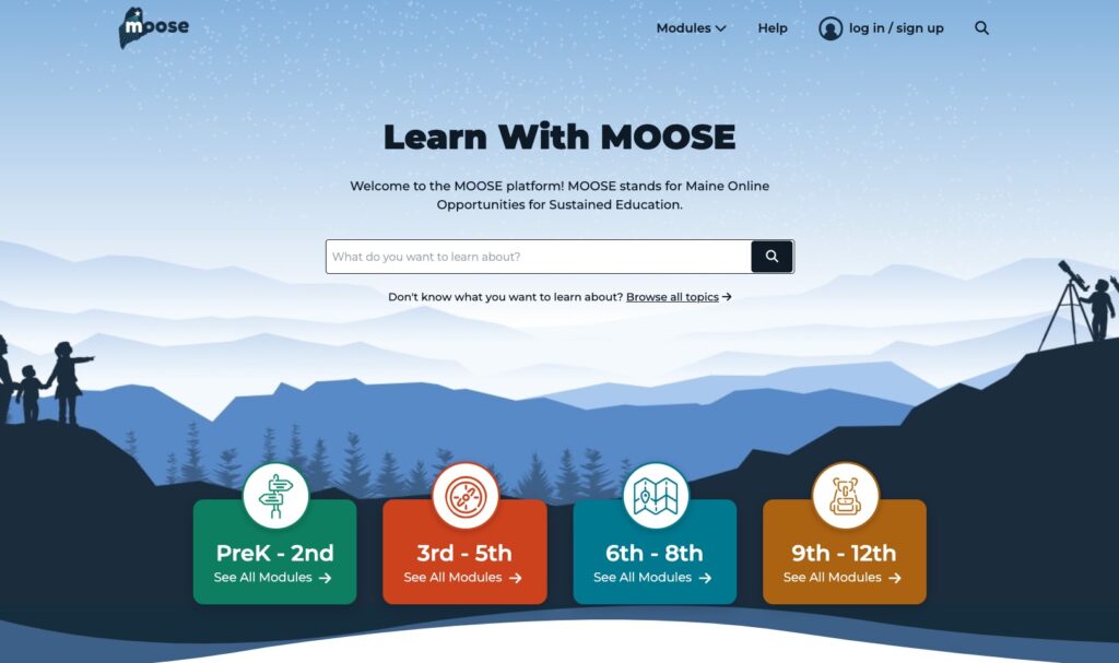
Example 1: The following screenshot of the redesigned Learn With Moose homepage shows how each grade band is associated with a distinct color and symbol that is implemented across the entire site. This makes it easier for users to recognize content that matches their grade level.
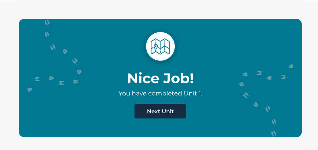
Example 2: This card is shown at the end of every unit or lesson. It provides an easy way for users to recognize that they’ve reached the end of the section and encourages them to continue to the next unit or lesson.
2. Engaging and memorable
Our second goal was to foster student engagement during instruction, which is important for helping students reach academic and behavioral goals. It is similar in UX design to decreasing the bounce rate of a site or app as an important metric of user engagement ensuring that users are meeting their needs and goals. In the classroom, this includes incorporating opportunities for students to engage with content through different senses or means other than listening.
Originally, Learn With MOOSE users were engaging with text through Google slide decks. To improve the user experience of the MOOSE platform, the team introduced H5P, a new interactive content creation tool that replicates some of the active ways of learning that are leveraged in classrooms, such as fill-in-the-blank and true-and-false questionnaires and flash cards.
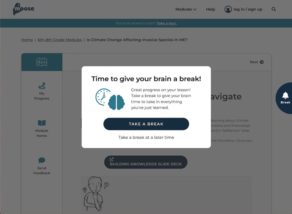
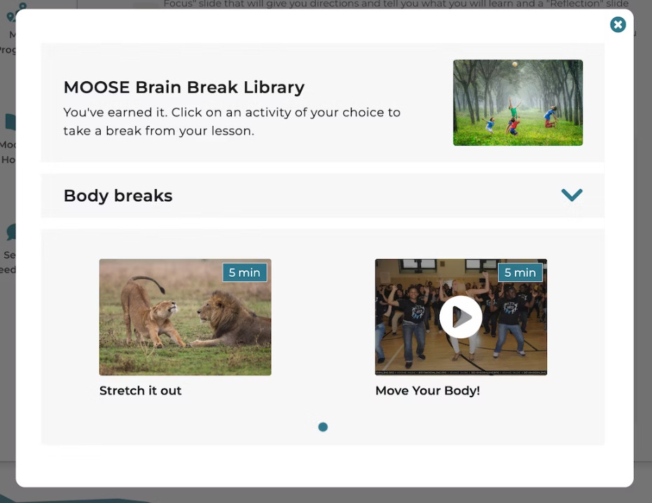
Additionally, a new feature called “Take A Break” reminds students to take a break from a module at certain time intervals during a lesson. Students are able to choose a break activity from a library of activities, such as reading poems, dancing, and yoga. This increases student energy, productivity, and the ability to focus on upcoming content.
Example 3: As a student completes a module, they are alerted at specific time intervals to take a break from learning. The first screenshot shows the alert users receive when they reach a specific time interval.
Example 4: This screenshot shows the library of activities that are presented when a user selects the option, ‘Take A Break’.
3. Follow a manageable step-by-step process
Last but not least, educators regularly strive to:
- Provide students with clear, action-oriented directions
- Break up large tasks into smaller and more manageable steps
- Accompany verbal directions with pictures, models, and readable text, so that all students can learn in the way best for them
These goals are similar to the ways UX design employs best usability practices to ensure websites and applications meet accessibility standards, so that all users can accomplish their goals.
When redesigning the Learn With MOOSE platform, we restructured the module and lesson workflow by breaking content into smaller chunks to avoid overloading a learner’s working memory. We also clustered related information to improve the capacity of memorization. Additionally, we introduced more transparency into the progress a user has achieved as they engage with different lessons. This helps learners gain a clearer view of which lessons and activities are in progress or completed.
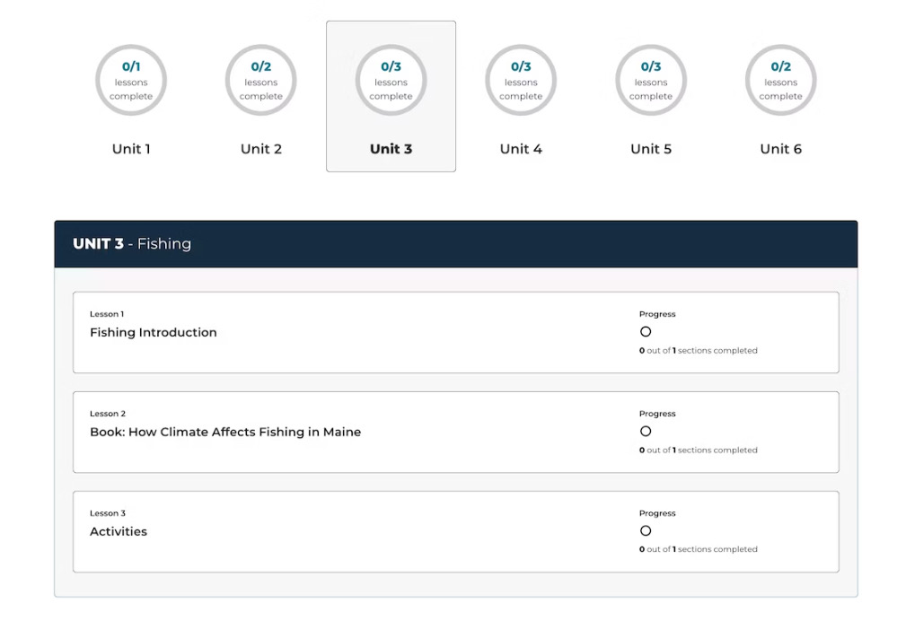
Example 5: This screenshot below is a section of the module page of the redesigned Learn With MOOSE platform. Before beginning or resuming a module, users can view the topics and total number of units, lessons, and sections within each module and their progress towards completion.
Conclusion
The redesign of Learn With MOOSE is an example of how some of education’s most challenging problems can be resolved when educators collaborate with UX practitioners to combine the talents they’ve developed in their unique professions. When Maine DoE partnered with the GovWebworks’s UX team, we were able to achieve a better online learning experience for students.
While the Covid-19 pandemic encouraged educators across the world to create accessible online learning experiences, the Learn With MOOSE platform is a product of the creativity that already exists across our K-12 schools. When we create opportunities for UX designers and educators to work together, we have a better chance of designing great products that transform and enhance the way we educate children online and in-person around the world.
Learn more
- Open Sourcing Education: Jenn Page explains how MOOSE is addressing education’s biggest challenges
- Maine Online Open-Source Education (MOOSE) case study
- Contact GovWebworks for more information about online education tools