By Tracy Totman and Jenni Hewes
Imagine logging on to pay a bill, but the button you need has tiny text you can barely read or is hidden behind a maze of menus. For many older adults, this is what navigating the web feels like every day. Senior-friendly digital design choices, like clear labels, simple navigation, and clean layouts, can make the difference between frustration and confidence online.
To highlight some best practices for senior-friendly sites, we spoke with GovWebworks UX designers Tracy Totman and Jenni Hewes, who have led digital redesigns for state agencies serving millions of citizens. From Missouri’s Department of Commerce & Insurance to Minnesota’s Department of Education, their work shows how thoughtful design can make websites more accessible, not just for seniors, but for everyone who values clarity and ease.
Here are their top reminders for creating senior-friendly digital experiences.
1. Use Plain Language
Jargon is a barrier. “Content should be written at a 6th–8th grade reading level, with short sentences and simple, direct words,” says Tracy.
Instead of “eligibility criteria,” try “who qualifies.” Respectful wording matters too—always use “seniors” or “older adults,” never “the elderly.”
2. Make navigation do the work
The number one complaint from users—of any age—is “I can’t find what I need.” Navigation should reflect user needs, not internal org charts. For example, a services section might be broken into “For Seniors,” “For Caregivers,” and “For Providers,” so people see themselves in the options. The goal: no more than two or three clicks to reach important information.
“Section menus—usually on the left or right side—that list all the topics within that section are a helpful way to orient users really well,” Tracy says.
3. Keep design simple and consistent
For sites with a lot of senior visitors, it’s important to keep the designs simple.
“Patterns and consistency can help people who are new to technology feel comfortable online,” says Jenni. “We like to keep the following best practices in mind.”
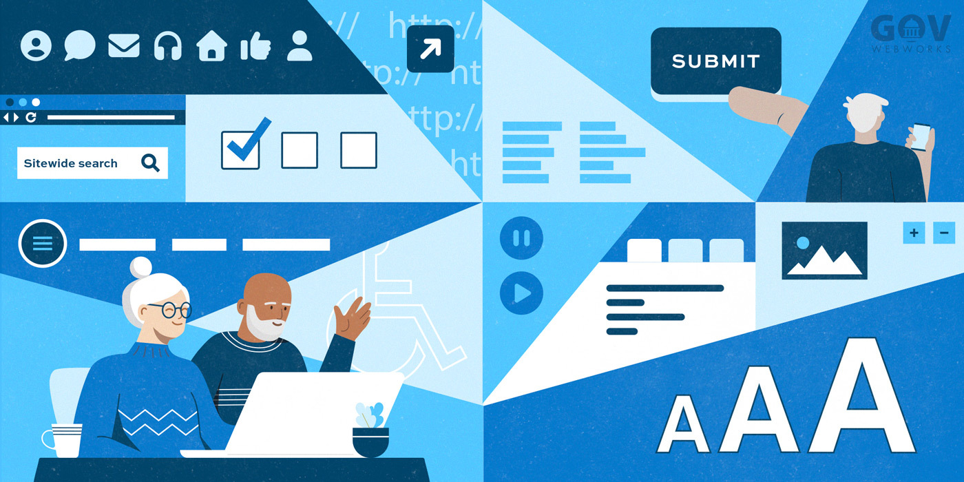
- Fonts & Contrast: Large, legible text with strong color contrast.
- Icons: Pair with labels so meaning is clear.
- Tabs: A great way to organize content without overwhelming the page.
- Consistency: Use color schemes, icons, and layout patterns to reinforce familiarity across the site.
4. Avoid common pitfalls
A few design choices consistently frustrate seniors:
- Autoplay carousels: They move too fast and cause disorientation.
- Long, dense text blocks: Hard to scan and absorb.
- Deep navigation trees: If users have to click five times to get to basic info, something’s broken.
“A common issue we see on text heavy sites are links buried inside a long paragraph,” says Jenni. “Having clear CTAs (calls to action) and buttons that stand out make it much easier for seniors to take action.”
5. Use helpful cues
Visual cues help orient users:
- Breadcrumbs show where they are in the site.
“Breadcrumbs are a big one. They help users see where they are within the site structure and make it easy to return to previous pages,” says Tracy.
- Eyebrows (labels above page titles) add extra clarity.
- Color-coding sections (e.g., “Healthy Living” in blue, “Licensing” in pink) reinforces structure.
- External link indicators (like a small arrow icon) prevent surprises.
6. Remember: Seniors aren’t all the same
Some older adults are highly tech-savvy, while others are less comfortable online. Good design should work for both. The best safeguard? Navigation that’s intuitive and content that answers questions directly without sending users hunting.
“FAQs can help,” says Jenni. “But only when focused and broken down by topic.”
Final words: Navigation is everything
If one thing stands out, it’s this: navigation is the foundation of usability. Seniors—and all users—need clear, simple pathways to the information they’re seeking. When sites fail, it’s almost always because navigation fails first.
“Designing for older adults isn’t about limiting features; it’s about removing friction,” says Tracy. “With respect, clarity, and thoughtful navigation, websites can empower seniors to engage confidently online.”
Learn more
- 7 Best Practices for Web Content Accessibility: How to make sure everyone can access your digital garden, by Sarah Crossman
- More UX Design topics on GovWebworks
- Contact us to learn more about our UX design services