UX and UI are like milk and cookies, better together. And we find the best results come from a discussion between the two. When designing for public sector sites and applications, we layer business analytics and knowledge about users with graphic treatments.
Each project we take on starts with UX – analysis of user workflows, user personas and needs, information architecture and content organization, positioning and proximity of elements, wireframes. Then we move on to the UI – look and feel, presentation, interactivity and other graphic elements. Our UI designers are fluent in the discipline of UX, and our UXers have visual design chops, but for the most part we bring our individual expertise to our projects so that our client designs benefit from both.
While each of our government and non-profit clients have different concerns, we often find similar challenges from project to project. In this post, we wanted to take a look at some common design challenges and how our UX team, represented by Sarah Crossman, and UI team, lead by Christopher Prinn, work together to solve them.
Visual Consistency
The Challenge:
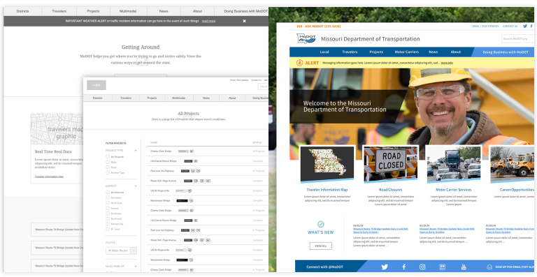
A government agency has regional divisions with decentralized ownership and management of content in their content management system (CMS).
UX Says:
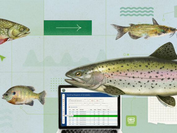
From the UX standpoint, the biggest risk is that the decentralized nature of the CMS creates a disorganized or disjointed experience for the user. In a CMS implementation, there are often opportunities to standardize key content with page templates that all content managers use for certain information. Take Missouri Department of Transportation’s website, shown here. Some of the priority content we identified with stakeholders related to information shared by the department about construction and roadwork that impacted travelers in Missouri. But project details were largely owned by regional content managers. So we devised a template to be used across the state to convey background information and progress updates about transportation projects. That way content managers were encouraged to compile the same type of information from project to project. End users then had a predictable, unified view of all projects from different regions.
UI Says:
Relying on a flexible, visual formula is a strong foundation for any site. Formatting of similar text, header treatments and graphics across multiple pages hugs the design and creates a familiar look and feel throughout a dense amount of varying content. This, along with a solid UX infrastructure, makes a sturdy, well-designed website.
The Solution:
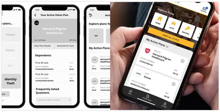
Self-Service Usability
The Challenge:
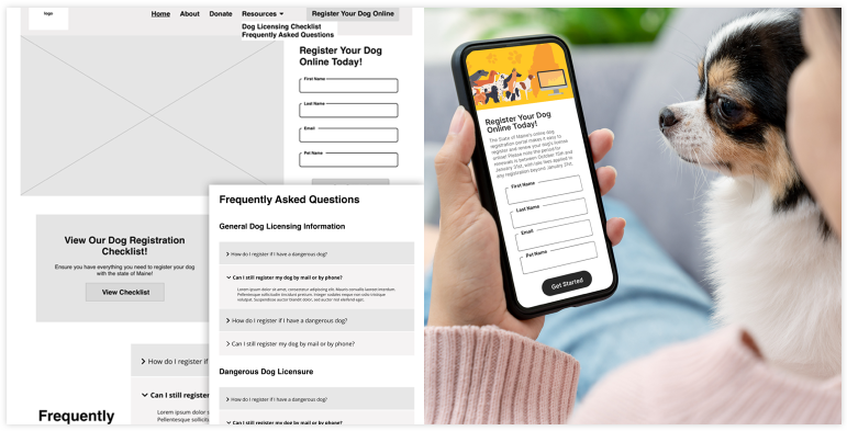
The agency wants to create opportunities for self-service by end users and achieve a reduction of calls and hands-on support by business staff.
UX Says:
People expect the convenience of being able to find information or complete transactions at a time and place that works for them, which may not be via a phone call during the organization’s office hours. No one wants to waste time, get stuck, or dedicate unnecessary mental energy to get a task done. We often write personas or use cases describing hypothetical scenarios of what users may be trying to do and what complicating factors they may face during their use of the site or application. We create clickable prototypes to test before development commences – watching click patterns and identifying errors users encounter in a clickable prototype helps point to the parts of the design that need more work. How easy is it for the user to recover and quickly move on with their process?
UI Says:
The easier it is to visually understand how to do-it-yourself, the less need there is for hands-on support from business staff. Strategically using bold colors and font sizes and weights helps the user better detect differences in areas of text or new sections. A consistent palette of soft, accessible hues creates a less stressful screen of information and helps the user understand a rhythm or pattern to filling out forms and clicking through appropriate flows.
The Solution:
Content Readability
The Challenge:
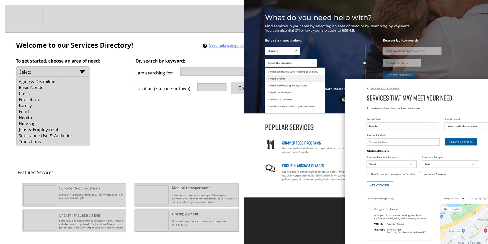
The site users span a wide range of ability including reading level and level of technical savvy.
UX Says:
One of my favorite challenges is the need to make something ultra clear and super usable while still using design elements that feel elegant and modern. With 211 Maine’s new service directory, that meant refining the language used to describe the types of services to use the simplest possible wording and simplified interactions. We knew from user research that users of an application like this are sometimes under heightened stress, and need the straightest possible path to getting help. To that end, we used a single dropdown selection with basic “I need” statements rather than a more advanced multi-select dropdown, to ensure we were meeting the needs of users who may struggle with more complex interfaces.
UI Says:
We believe that keeping it simple is the safest, most obvious path when trying to have a design work for both low and high levels of reading or technical comfort. Relying on abstract concept iconography or unnecessary design layouts doesn’t make sense. Trying to be too clever with a design will isolate too many users. A simple design will be appreciated by all.
The Solution:
Mobile-First Design
The Challenge:
The agency serves customers who are primarily on mobile devices, and need an experience that is either an app or that prioritizes mobile usage.
UX Says:
Our user research has suggested that for some populations of users, often those turning to a government site for information or assistance, their phones ARE their computers. It’s no longer acceptable to send mobile users to a desktop application or to have a site that is only fully usable in a desktop browser. Workflow analysis and an understanding of users is key to app design. We ask ourselves: What are these users doing when they open the app? Where are they? What information or functions do they need quick access to? And also, what devices and browsers are they on?
UI Says:
Keeping in mind the strengths and weaknesses of a device is important. The lack of a hover-state interaction on mobile may be a drawback, but the ability to side swipe more easily is a plus. Being conscious of downloads and data usage is another strong consideration and with less screen area on mobile devices, we need to be aware of font sizes. We prefer to design in simple grid structures to allow for content to resize, stack, and respond as needed.
The Solution:
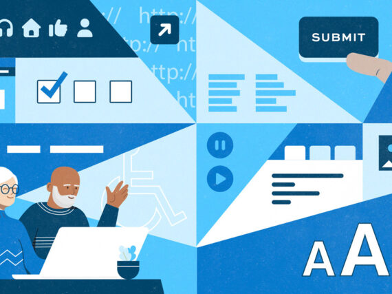
Accessible Design
The Challenge:
The organization serves a public need or is a part of a state or federal agency, and must ensure all consumers are able to access the content.
UX Says:
It is important to start from an educated view of what web accessibility is and what it involves, and design for those who have less motor control or specificity, those who don’t perceive color the same way as other users, who are more sensitive to movement and flashes, and so on. At GWW, we keep a library of best practices for ensuring accessibility of our designs, but we also take time to explore design alternatives that meet accessibility standards so that our concepts aren’t stagnant or too similar from project to project, and we always keep learning.
UI Says:
Accessibility requirements provide an interesting challenge when it comes to visual design. Just because it’s highly functional to all, it doesn’t mean it has to be plain or boring. The use of clean, legible fonts with proper text sizing and weights is the best place to start, and using colors that provide good contrast helps with readability. Trying to avoid the use of iconography that could be misinterpreted is something that should be considered at all times. Not distracting from the core content with superfluous visuals should be a priority.
The Solution:
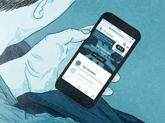
Inclusive Design
The Challenge:
The organizational purpose or mission carries sensitivity or potential stigma, such as substance use-related services.
UX Says:
We frequently work with clients whose customers are an at-risk population. It’s not only our end product that needs to be considerate – any interaction we have during design and discovery (such as user interviews) needs extra attention to avoid bias and to express sensitivity and consideration. A project that involves this particular challenge benefits tremendously from user research or other methods for telling the user story – we seek to increase our understanding of the circumstances users face so that the solutions we devise can accommodate those issues and ensure a positive experience that does not drive users away. It’s crucial to be open to learning from those that know better than you, whether it is members of the community or those who serve the community.
UI Says:
Age, race, education, and financial differences are all a huge consideration, and the design will have to take a neutral approach so as to not alienate one type of user. A simplified interface will help legibility and readability, and a polished, clean look can help promote credibility and comfort for the audience. Making a site’s visuals feel inclusive and safe can be achieved. Sometimes the use of abstract or generic illustration or vector art can denote themes like “family” or “people” without actually representing “real” people. This technique allows the design to address a concept or theme that can be understood and/or accepted by all.
The Solution:
Learn more
- Contact us to learn more about how we can help with your UX and UI
- UX Playbook Part 1: How we identify project goals and user needs with heuristics, interviews, and surveys, by Amy Mauriello
- Beyond Genericized UX: How to avoid McDonaldization of UX, or oversimplification of the design process, by Sarah Crossman

